Importance of Icons
Have you ever had that moment when you’re sitting with a user watching them use your application only to see the look of frustration on their face because they’re confused about what to do next or what a particular icon means in your application? Now, of course, this can happen for a variety of reasons. Perhaps you’re introducing a completely new mental model or way of thinking in your product and as a result it requires some growing pains in order for users to grasp how to use the product. Other times, it can be a simple mistake made when selecting an icon for a task or activity that just missed the mark entirely.
This post is meant to convey a simple mistake that occurred on an application I served as product on where we were building a photogrammetry web service that provided two options for the types of photos that were captured for the photogrammetry processing (for those unfamiliar with photogrammetry it is when a series of pictures are taken of an object or location and then those photos are passed to specialized software that processes those photos and returns a 3D model of what was provided).
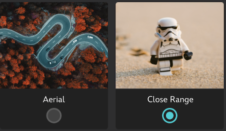
The two types of input we expected to capture were close up photos of objects or aerial photos of a location captured by a drone. As you can see in the image below we attempted to show these options in the form of a high aerial view of a road to indicate the drone type of capture along with a small object in the form of a lego storm trooper for the close range object. The result was confusion amongst the users along with having to add text descriptions along with explanations of what each item meant.
Less than Ideal Icons
Upon seeing the user response to the ‘less than ideal’ icons, I instantly reached out to my extremely talented UX designer colleague for help who was able to turn around a fantastic set of icons to depict aerial photo capture and close up object capture in a much better fashion.
The result of the newly design icons is below:
Great Icons
As you can see with the icons above, we no longer needed instructions or supplementary text describing what they meant. In fact, as soon as I started user testing the new icons, the response was immediate. I no longer had to explain what each item meant or provide lengthy descriptions, I simply sat back as the users performed the correct set of steps necessary to complete their task within the Photogrammetry web service.
Wrap Up
Icons are often overlooked when building a new feature or service within your application but they can often be the source of frustration for users as they try to navigate a potentially complex user interface. Remember to borrow on patterns or ideas from the real world as you design icons and also remember what the icon is really trying to represent. We’re in the business of making lives better and providing services that help streamline day-to-day activities and icons in our apps should reflect this.

